10 Psychological Blogger Design Tips To Increase Website Conversion
10 Psychological blogger design tips to increase website conversion rate and traffic for blogger blog. Make brand and boost traffic.
 |
| 10 Psychological Blogger Design Tips To Increase Website Conversion |
10 Blogger design tips for you to increase conversion rate and traffic of your blogger blog. Some important widgets and presentation technique that can boost your blogger blog traffic and can increase your conversion rate.
1
| Use of About me page with little description on the main page. |
How to use about me page? Well it is a common question but it gives a different impression on the user while visiting your blog everyone wants to know about you like who created this blog and who is the admin. Even I want to know when I visit the websites. So always use about me widget in your sidebar on the homepage and other pages. It really works and also helps to build relationships and trust between you and your visitors.
What should be written in about me page.
I have seen much about me pages, where people show them as something special which they really are not. Not all but few of them. Well my advice do not try to be fame just be real because your visitors can understand you much better by your content and writing skills.
- Your name.
- Your Primary and current Education.
- Your job description.
- Your contact details.
- Your Success Story.
- Your social media presence.
Take a look at the below images of most famous two blog authors. I think many of you knows about them.
 |
| Short bio of author of labnol |
 |
| Short bio of author of techgyd |
In both of the images you can see very clearly that Amit Agarwal has a more creative way of describing him.
Note - Amit Agarwal has put his email address in the author bio. Now what kind of effect gives to the user. Now we do not have to find his email or to click on the contact us page to find his email address. Now if I have felt any problem I can directly contact with him. Along with he also shows his achievement that people really want to see.
"Neil Patel says he likes to read the success story and everyone wishes so."
And in the second image see Saurabh how smartly he told about him that includes all about him.
Note - Both of them have put their personal and professional short description on the main page.
So try to be smart and put a smarter and shorter bio as a widget in your sidebar that helps you build trust and relationship between you and your visitor to increase website conversion rate and you know more trust more traffic.
2
| Use Of Arrow (A Subconscious Call To Action). |
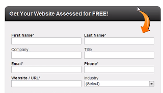
The main concept behind using arrow is diverting user attention for a special cause well you can do it by many ways first by using the dark color combination for a special widget in your blogger blog or website like the other bloggers and web developers do for the subscription box. They design subscription box in a dark color to gain the user attention.
The result of using an arrow.
But there is another blogger tip that is stronger than the use of dark colors and that is use of arrows. It has been proved by many web consultants that arrow convinces users to click on the direction where they are pointing and bloggers who have used them shows that they got improvement in their sales, sign up and subscribers which was less before using arrows. And conversion increase in subscribers, increase in more clicks and etc. So using arrows have been very beneficial in increasing the conversion rate for a blogger blog or website.
Example of successful Use of Arrow.
 |
| Example of successful Use of Arrow:- |
Another successful use of arrow to increase conversion rate.
 |
| Use of arrow to increase conversion rate |
Now look at the first images using the arrows to sign up does not it strike you. When you look at the images you automatically pushed to sign up and the message is also clear that you have to sign up.
Now take a look at the image no. 2 when I see that banner it strikes me to see his twitter profile and the good thing is that I subscribed to him and following him on twitter.
3
| Use Of Video. |
Using a video in your post or in a sidebar cab brings lots of changes in users mind because all that we are doing is to convince users and to make an image in your readers' mind . So what happens when you add a single video in your website sidebar.
- Video should be about your website.
- The video should clearly mention what kind of product or blogging tips you will get on this website.
- Video should be short.
- The voice should be clear.
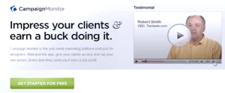
See the example here.
 |
| Use of video |
Description - As you can see when you land on this website's homepage there is a video that clearly describes what type of product and services this website provides. Here it is not a matter that users click on a video or not but the main point is presenting your website as a brand and then it leads to higher conversion rate because such blogger widgets like video builds a trust in user's mind for your website or blog.
4
| Insert Your Personal Intro Video. |
Yeah here is the main point when you insert your own video study shows that 60-70% people click on the admin introduction video.
 |
| Author video |
And if you insert it in your about me page then the clicks are more higher. Reason is simple, everyone wants to see who is the person behind this blog or website. So make your own video showing your face and voice and then see the magic. It will definitely increase your conversion rate and traffic of your website or blogger blog.
5
| Put Testimonials and Recent Comments. |
Again the main focus is on branding of your website and to make it another widget that you can add in your website or blogger blog is a recent comments widget or try to use user's testimonials in your left sidebar or right sidebar.
 |
| Recent comments |
It gives an impressive reaction over the users mind that "Oho Lots of people are commenting here" So it strikes your visitors mind and then he trusts your website which later converts into a higher conversion rate of your website or blogger blog.
Effect of this testimonial on users.
When a visitor sees such a testimonials his psychological mind automatically takes your website as a brand and reputed one. I found this image in Neil Patel's blog and whenever I see this image I really think he is a big deal. So why do not you do for your blog too.
6
| Use Soft Call To Action Buttons Like Click Me. |
Now all the above blogger tips we use is to increase website conversion rate and to get more traffic for your blog. Here is another final but very powerful design tips that will increase your website conversion rate is how you should use your button.
 |
| Website description video |
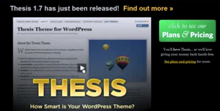
Now see closely here they are using the words "click to me" on the button. And what happens when you see such words. Well it is a psychological effect it is a soft call to action thing and a person clicks on that button and buddy here through this way you are increasing your conversion rate.
So the point is always to use soft call to action words on your button if you really want your users to click on those buttons.
So all the above blogger design tips were described to increase your website conversion rate using about me page, personal video, admin video, arrow, soft call to action buttons and many more. Use this and then you would not have to search on the Google that how to increase website conversion rate and traffic.
If you liked this tip then please share it god will bless you and make your wish come true.


