5 Great Email Subscription Box Ideas To Increase Blog Readers
How to optimize email subscription box to increase more readers for your blogger blog. Here we have 5 great ideas to do this.
 |
| 5 Great Email Subscription Box Ideas To Increases Blog Readers |
A blog is known by the reader it has. So to increases the blog readers, First thing that you have to do is optimize your email subscription box. It must convince and impress users so that they subscribe to your blog. Most of the people like me does not know how doing that so I decided to read master blog. Master means which have lists of subscribers and their most of the traffic from those lists. So the question is how they did it and what makes them different from us. So today we will visit all those blogs which I consider master and figure out what is hidden in their email subscription box and why they are so successful when it comes about the number of subscribers. Their writing tips have always been beneficial for me.
NOTE : - Email subscription box itself is not the only reason for their long list of followers but also their content, on page optimization, Backlinks and Search engine friendly template. They always share new and different ideas which increase their visibility on social media through sharing.
We will get ideas from their email subscription box.
Blogging tips that i am going to mention below are based on user experience and experts view. I am sharing what the experts do for their blog and website which results into long list of followers and loyal readers for their blog. First it includes quicksprout. One of my faviourite blog. I am big fan of Neil patel. So today i am going to put some light on email subscription box of quicksprout. Along with some examples from other websites.
Email subscription box ideas from quicksprout
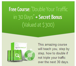
Now take a close look at the quicksprout blog of Neil Patel. Now tell me what you see. If we see closely to the email subscription box of Neil Patel then we will find that his color combination of email subscription box matches with the color of his navigation menu. Many specialist says that green color also helps to increase website conversion rate.
Navigation color is #89c83c
 |
| Green color navigation |
Email subscription box color #89c83c
 |
| Color is same like a navigation menu |
Now this is called perfect blogger design.
Call to action buttons
 |
| Call to action buttons |
He is using call to action buttons. An example of perfect website conversion optimization. Mostly people use sign up now button like me but it does not convert your reader into subscribers. So another great thing that we can learn from quick sprout blog is the use of call to action buttons. This two thing prompts user to subscribe to your blog and strikes the user's mind and the result is " you got a subscriber". With these there are many other tactics that you can use to divert user attention. You can read it here.
Call to action words
Use the words that prompt the user's mind. Always write positive words, This works better than the sign up now word. You can take example of words which used by Neil Patel on quicksprout.com. He does not use "sign up now" words but use "Yes, Lets start the free course".
Now you tell me what strikes your mind "sign up now" or "Yes, Lets start the free course". I think you know the answer and this is the reason why Neil Patel has a long list of followers and readers and this is the reason his every post gets at least 200 comments.
Use picture instead of bullet points
 |
| No bullet points |
Many people use bullets when showing the quality of their websites and themselves. Instead of using bullet points you must use right symbol. It emits positive energy and also prompts users to subscribe to your blog.
For branding you can read this awesome article recommended by Ana Hoffman : - Blogger branding
Right color combination of buttons.
Green color button
 |
| Green color button |
 |
| Yellow color button |
There are two colors which are mostly used in buttons and these are yellow and green. These are the most highly convertible colors. And many website conversion optimization specialist agrees with this fact that if you use green and yellow as base color for your subscribe button then you will get more clicks on that button. This attracts user and hence this way you convert your visitors into readers. Well all these tips and use of widgets are the pillars of perfect blogger design and SEO.
Read this For More Information : - Optimization of buttons
Final words
After visiting many successful websites, I have little to do things. If you apply these techniques surely you will get more followers for your blog and loyal readers.
- Make your email subscription color same as the navigation menu.
- Use call to action words on a button.
- Use yellow and green color for buttons.
- Use right symbol instead of bullet points.
- Show what you did and what can do.
Note : - There are several different factors that are responsible for success like loading time of blog and their blog promotion ideas.
So this was all the email subscription box optimization ideas to increase your blog readers


